
Milliman / AKUR8
Actuarial Reserving Software
A software platform that analyzes casualty reserves, evaluates unpaid claim liabilities, and estimates loss costs. It leverages advanced insurance models and actuarial methodologies to support accurate risk assessment, forecasting, and financial decision-making.
CLIENT
Milliman / AKUR8
ROLE
Principal UX/UI Designer
AREA OF FOCUS
Casualty Reserves • Web
TIMELINE
May 2024 - June 2024
13 week engagement
OVERVIEW
The goal of the client was to transition to the Cloud since they are desktop only and implement an Azure foundation with the flexibility, resiliency, and best practices to serve the needs of the application. They also wanted to enhance and add value to the software NextGen user experience, in order to retain current customers (with minimal friction) and increase revenue.
THE CHALLENGE
Our team was given the question of “How can the UX be enhanced, bringing the software to the next generation?” Fundamental interfaces have been started, and the first reactions were that it was very similar to the old software. Their customers have indicated they want it to be more contemporary.
MY ROLE
As the Principal UX Designer, I was responsible for creating and evaluating low-fidelity design concepts to improve the NextGen user experience based on user needs and workflows. I collaborated closely with the research team, shadowing customers to identify personas, jobs to be done, pain points, and opportunities. I developed three low-fidelity prototypes for UX sprint testing and worked extensively with cross-functional team members, including actuarial subject matter experts, to ensure each concept reflected key hypotheses and aligned with business objectives.
GOALS & OBJECTIVES
The client's main objective was outlined during the 3-day project kickoff workshop.
Product Goals
Efficient operations and agility, with everyone in NextGen
High retention from desktop to cloud
Revenue-generating, with an increase in price and additional upsell opportunities
Expanding customer reach and international markets
Visually enticing with differentiating features
Engagement Goals
Understanding
What matters to customers?
What is the User Experience for the analysis workflow?
What value does cloud bring to customers? <--- Deprioritized
Which features can be deprecated? <--- Opportunistic
Collaboration to interpret learned and make decisions
PROCESS
01 Discovery
The engagement began with a three-day onsite kickoff workshop focused on aligning stakeholders around project goals, objectives, scope, hypotheses, and desired outcomes, while also incorporating product demos, actuarial science walkthroughs, reviews of existing research and artifacts, workflow mapping, ideation sessions, concept refinement, and the prioritization of knowns, unknowns, and key assumptions.
02 Define
As a team, we collaborated to define the core user workflow, then identified the key activities for each UX sprint and prioritized the designs needed for user testing and validation.
03 Design
Created early sketches and low-fidelity wireframes that were developed into clickable prototypes for each of the three UX sprints.
04 Deliver
As this was a 13-week engagement, it marked only the beginning of the client's journey toward achieving their goals. During the final delivery handoff, we also provided materials outlining the remaining tasks, NextGen's progress towards its objectives, the projected timeline, and recommended approaches moving forward.

Kickoff Workshop & Activities
Given the thirteen-week engagement, we maintained a packed agenda each day. Day 1 focused on why we were there, process overview, workstream goals, and product demos, including walkthroughs of actuarial science. Day 2 involved hypothesis refinement and workflow mapping. On Day 3, we held several ideation sessions, covering the mission scope, defining the core workflow, brainstorming data and information, and prioritizing key concepts.
Why We Are Here
Bringing the reserving software to the next generation (NextGen).
We want to move outside the desktop to be completely browser-based.
We’ve done this about once every 10 years.
Enterprise products are almost all handled on desktops.
The last tool (most?) actuaries would ever give up is Excel. How do actuaries continue to do that when everything moves to a browser?
We’ve been actively working on new architecture, but in a bit of a limited capacity. We’re focusing more on that now. Fundamental interfaces have been started, but the first reactions were that it was very similar to the old software.
We hope to get out of the engagement an understanding from a cross-section of users on how the UX can be enhanced.
Plan Overview
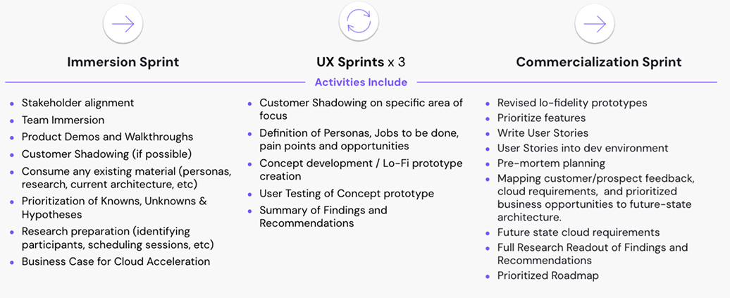
Below is an overview of how the work was prioritized and allocated across each sprint.
Hypotheses
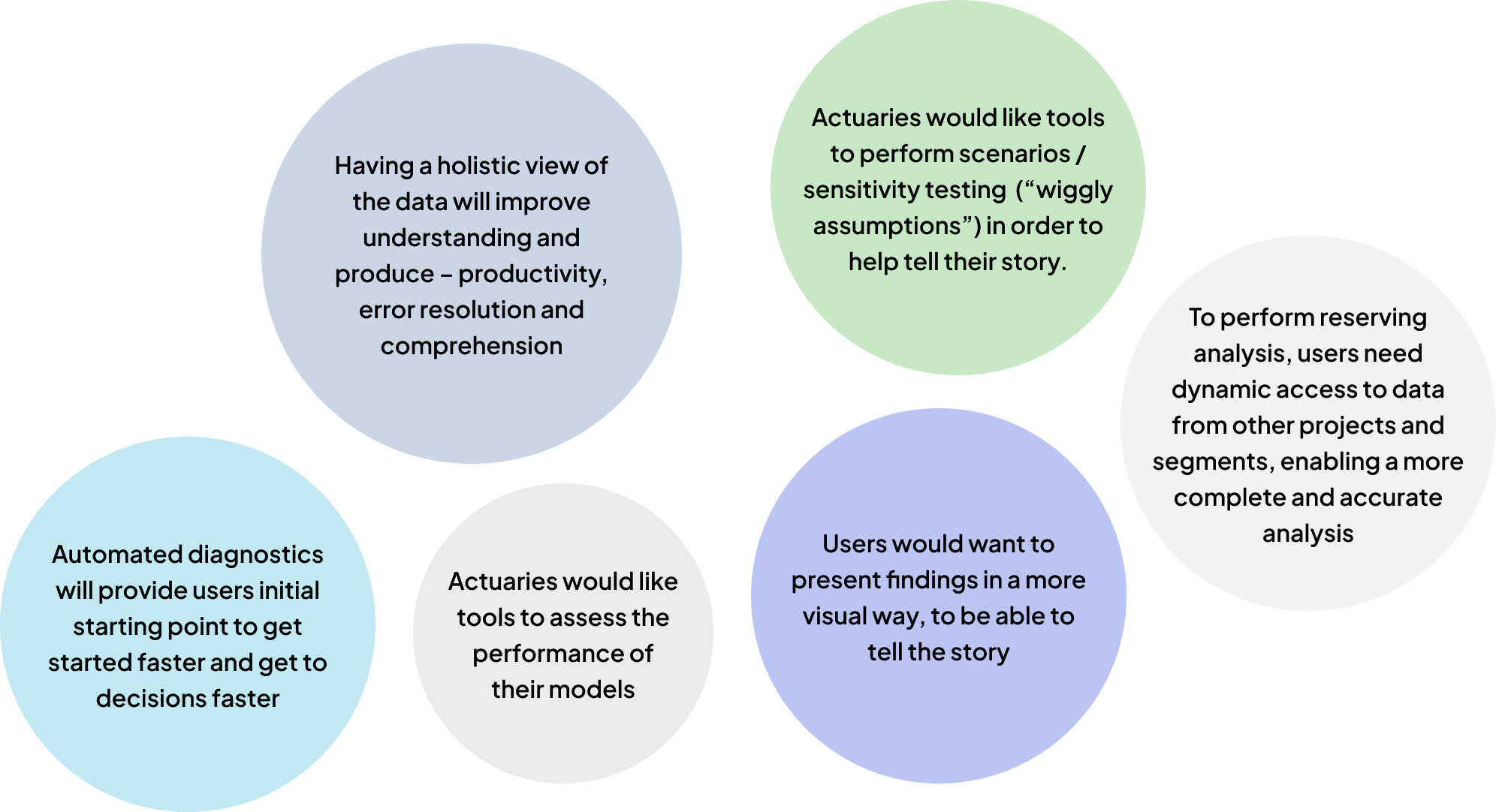
Below are several key hypotheses identified by the team to explore and validate with customers throughout the engagement.
Defining the Scope
A core workflow is defined for how actuaries will conduct their analysis in a browser-based solution, with a landing page (dashboard) visualized approach, eventually completing their analysis. Focus on one project and segment, as users spend about 80% of their time within a segment analysis. While the foundational analytical processes remain intact, this effort focused on reimagining how information is organized, visualized, and delivered to users.
The project scope focused on single-segment analysis across any object type. Out of scope were general linear models, enterprise software functionality, stochastic workflows, calculated segments, and external reporting or presentation capabilities.
Jobs to be Done
Main job for the reserving actuary: Estimate loss reserves
Second job (or main job of another role): Communicate the story of the analysis
Aspirational jobs (potentially more motivating): Getting promoted, increased influence/voice, and recognition.
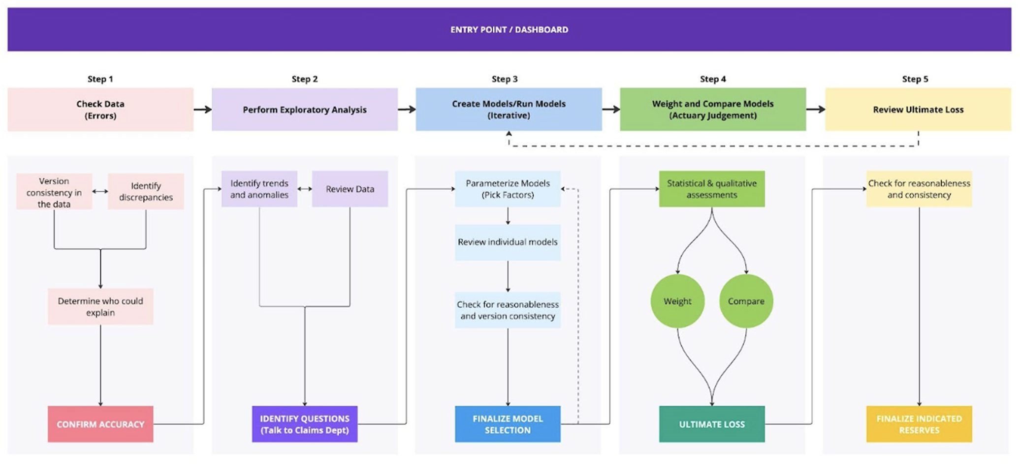
Core Workflow
We mapped the end-to-end workflow actuaries follow to conduct their analysis efficiently and consistently.
Ideation Session
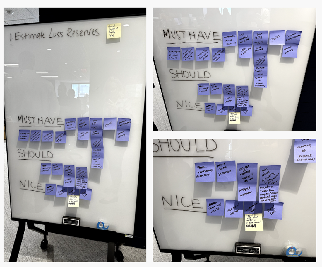
Actuaries need a better jumping-off point before they start their analysis, so we brainstormed all elements or data points that should exist at the start of the workflow.
Categorized ideas into Must Haves, Should Haves, and Nice to Haves
Crazy 8s is a fast and effective sketching exercise that challenges people to sketch eight distinct ideas in 8 minutes.
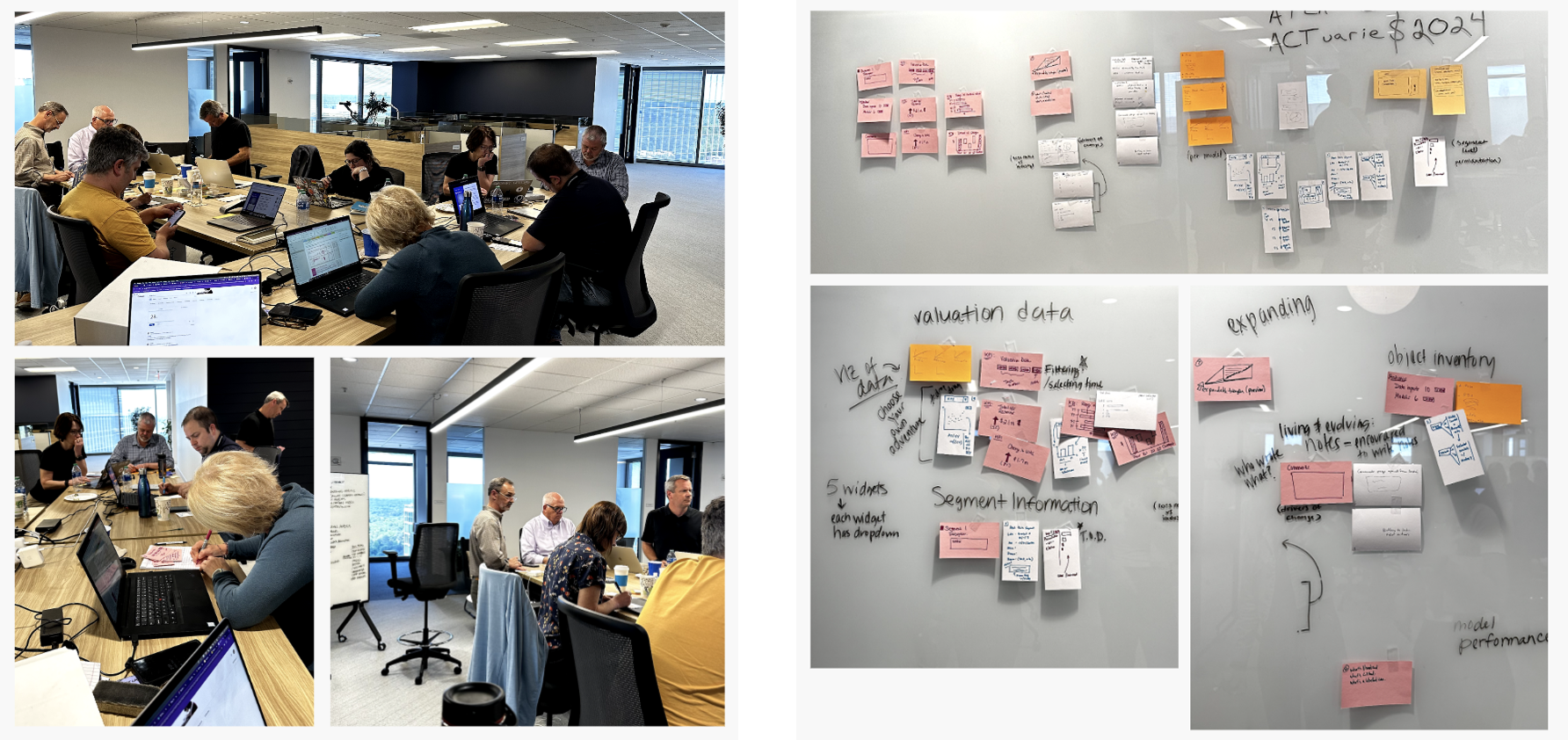
Refined and voted outcome ideas
Objective Information: Showing a summarization of big data
Segment Information: About the segment, triangles on demand, not just text, can be visualized
Activity Log: Timeline of history (user x did this), related to a task
Visualization of Data: Need dropdown, select widgets, selecting time views
Notes: Living and evolving, encourage writing notes, who wrote what
Layout: Probably can’t show everything in one view, widgets, expand/collapse information, and inventory lists
Early Sketches & Ideations
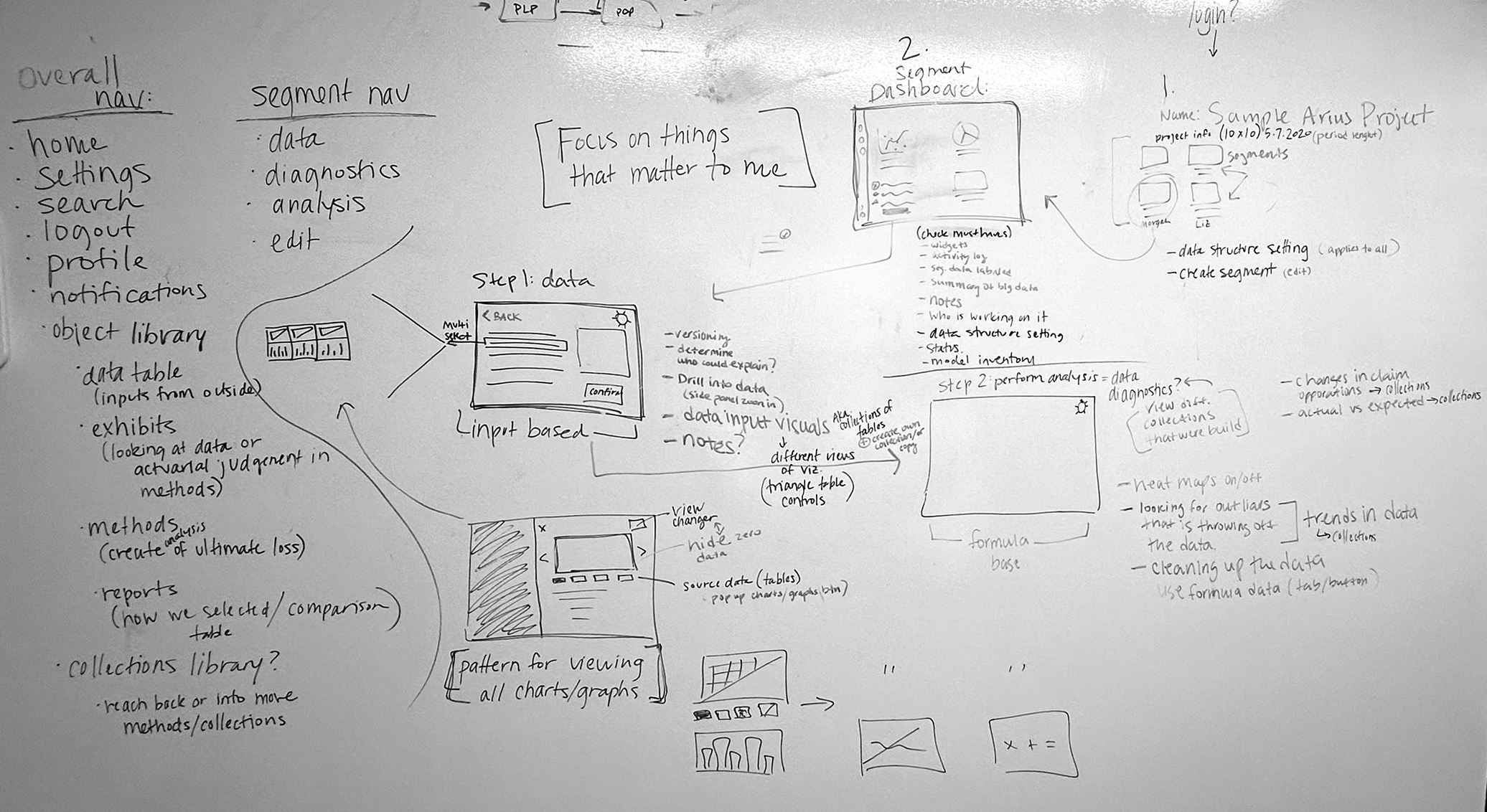
Whiteboarding the current workflow to get a better understanding visually, and what we can add to the new dashboard page.
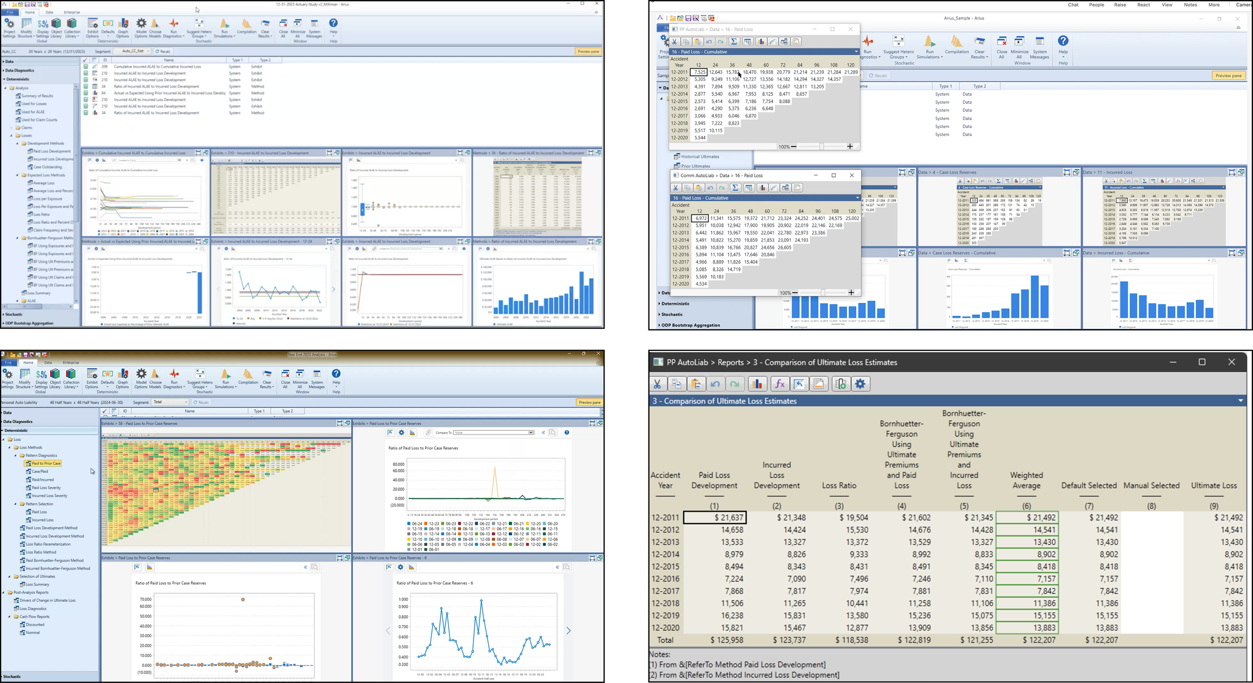
The current state of the software.

Final Readout & Learnings
Core Workflow
During the three UX sprints, we successfully tested most of the core workflow defined in the kickoff workshop.
Research Background
Final summary of all the people and companies we interviewed.
Personas
Final summary of all the people and companies we interviewed.
Research Learnings
A consolidated view of the insights uncovered throughout the research process.
Core Concept Evaluation
A Segment Dashboard is appealing and has the potential to make analysis more efficient, if insightful to users.
Users are open to leveraging (more) visuals if relevant and need easy access to corresponding data.
Users are open to more structure for a cleaner, approachable interface & supportive navigation. *Further validation required to assess new taxonomy.
The updated Models page is intuitively organized.
Users do not crave the ability to explore new models.
More tools to interact with/customize views of tables & graphs are welcome, but likeliness to use varies.
What Matters to Customers
Customizing to their business
Having structure and consistency, balanced with flexibility and customization
Transparency over time and across people involved
Identifying, understanding, and explaining deltas & trends
Viewing and easily accessing (a lot of) related data, fluidly and concurrently
Exploring ‘what ifs’ and assessing the impact of choices
Minimizing errors
Minimizing disruption from tool & process updates, across stakeholders
Segment Dashboard
One of the hypotheses we tested was whether having a holistic view of the data would improve understanding and increase productivity. Is a Segment Dashboard desirable?
Cycle 1
Since this is a new concept for the software, in the first cycle, we didn’t build out too much in the prototype because we wanted to hear initial reactions from customers on a dashboard.
Prototype Password: triangle123
Cycle 2
In cycle 2, we tested additional hypotheses and refined the segment dashboard based on feedback from cycle 1. The prototype also included a happy path to the segment dashboard, allowing us to gather more customer insights on whether this information aligns with their needs.
Takeaways
Appealing to most as an additional offering (but users can continue working without it)
Has potential to make analysis more efficient – if visuals are truly insightful and key indicators are relevant
Especially valuable if it can replace Power BI
Additional efficiency gains from a clean layout with direct access to content and project management tools
(Potentially more) valuable across segments and for reviews
Recommendations
Provide a Segment Dashboard or prioritize a more enticing concept in NextGen
Investigate the Review stage, explore if content belongs on the Dashboard or elsewhere
Continue to refine which visuals/diagnostics and key indicators to have out-of-the-box; make these customizable
Investigate Power BI usage for inspiration
Prioritize customizable Change In Ultimate Indicator, Activity/Audit Log, Notes
Pursue the Data Outliers idea, perhaps in the Data section
Prototype Password: triangle123
A More Visual Approach
Are customers open to a more visual approach? (leading with visualizations and generally using them more).
Takeaways
Users are open to leveraging more visuals - if relevant, informative, and understood
Direct, contextual access to underlying data supports investigation and navigation and aligns with existing design patterns
Visuals can be illuminating; numbers are non-negotiable
Tables/triangles can be “visual.”
Recommendations
Lead with charts/graphs that users can easily, clearly understand (whether new or familiar)
Allow customization
Explore offering guidance on using charts/graphs
Make it easy to access the numbers underlying charts/graphs
Continue providing heatmaps and other ways to visually showcase patterns, trends, outliers, shifts, and flow in tables/triangles
“I like how it’s visually driven; however, a lot of people like to see the numbers, particularly the older people.”
Below are the prototypes developed throughout each design cycle, along with the visualizations introduced and refined during each iteration.
Prototype Password: triangle123
Structure & Customization
Are users open to a more structured, more guided approach?
Workflow-oriented tabs & Target Variable cards
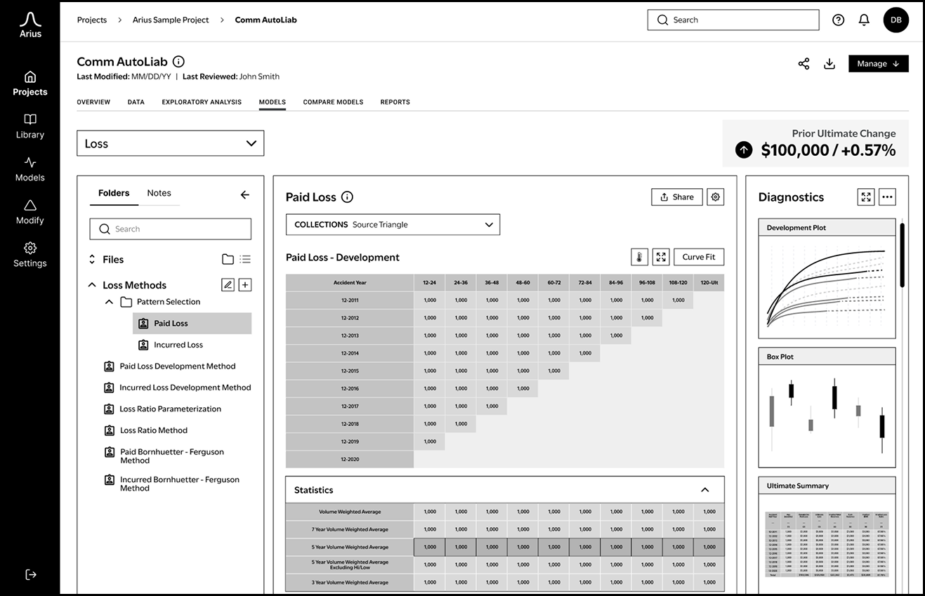
Models (& Compare Models) organized by Target Variable
Takeaways
Software structure helpfully provides organization, flow, and ease of use - while flexible navigation supports the fluid, iterative nature of work.
Users are open to more structure (workflow tabs, organizing by target variable) for a cleaner, approachable interface & supportive navigation.
Requires further validation (Product & UX)
Customization is key to support each company’s business, actuarial, and reporting practices
Customization and flexibility must be balanced with standardization and consistency
Recommendations
Keep the workflow tabs concept; continue fleshing it out
Explore & assess Target Variable pages and cards across methods and other scenarios
Consider cost of this effort with anticipated benefits - to current and future users
Allow for customization when needs are driven by business variation and there’s no risk to errors (e.g. column order)
Investigate & explore when individual views are appropriate or consistency is needed
Models Page
Is it intuitively organized? Anticipated friction with this direction?
Takeaways
The updated Models page is intuitively organized
When making LDF selections, users need to see the triangle and other factors
Adding a ‘Logic Row’ and elevating Curve Fit are additional enhancements
Recommendations
Validate the page structure with other methods and target variables
Continue to refine features & functionality
How diagnostics open, large triangle affordances, high fidelity UI, etc.
Prototype Password: triangle123
Compare Models
Takeaways
The Cycle 3 residual graph was not well understood and did not inspire model iteration or exploration.
Users do not crave the ability to explore new models.
More tools to interact with/customize views of tables & graphs are welcome, but likeliness to use varies.
Recommendations
Deprioritize providing a new graph in Compare Models - or explore one that is more easily understood and relevant.
Explore providing contextual graph guidance to educate users and encourage usage
Prioritize the ability to change table column order and heatmap functionality
Improve defaults in Comparison of Ultimate (shifting weights)
Make it easy to add Prior Ultimate to the table
Impact of Aesthetics
Even in low fidelity, the prototype looks and feels more modern than today’s interface.
“Prettier, more 21st century, not the Windows ‘97 old UI… this looks like it cares about UX… Software now looks a bit old and a little bit intimidating.”
“I guess current Software is a bit stale (visually).”
“It just looks nice, clean, and pretty intuitive for me.”
Final Mid Fidelity Wireframes & Prototypes
As this was a 13-week engagement, it marked only the beginning of the client's journey toward achieving their goals. During the final delivery handoff, we also provided materials outlining the remaining tasks, NextGen's progress towards its objectives, the projected timeline, and recommended approaches moving forward.
Click the button to view the final prototype delivered to the client (password: triangle123), or browse some of the wireframes below.
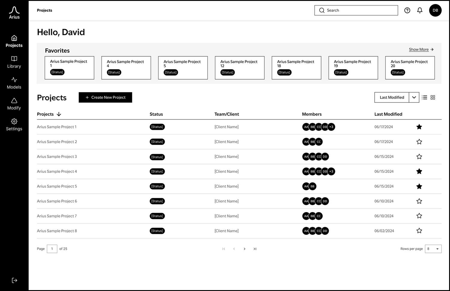
A list of all projects the user is working on, with options to create a new project or add projects to favorites for quick access.
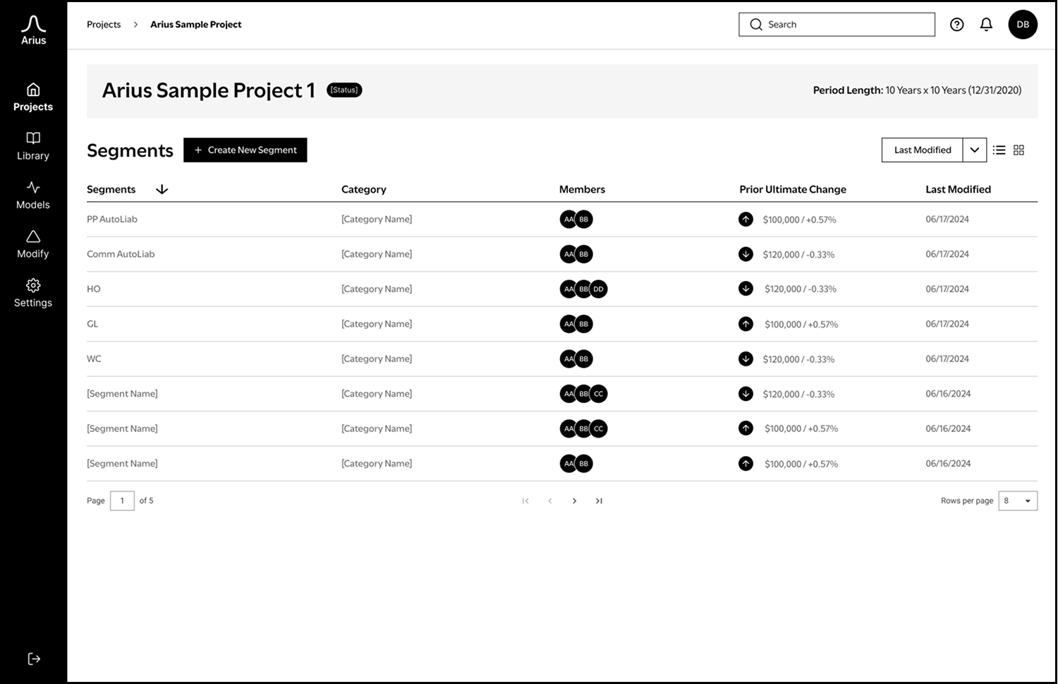
A list of all segments within a project, allowing users to view the prior ultimate change for each segment, the last modification date, and the team members involved.
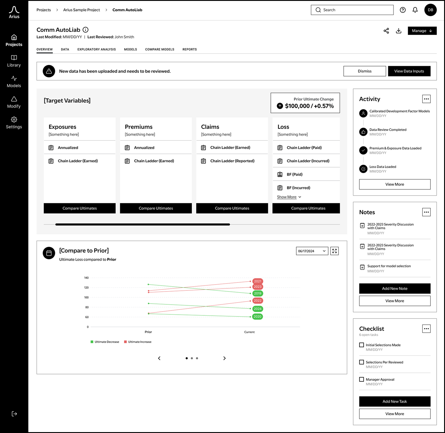
High level overview of a segment, consolidating key information in a customizable way. It’s intended to offer a quick glimpse into important insights without performing any in-depth analysis.
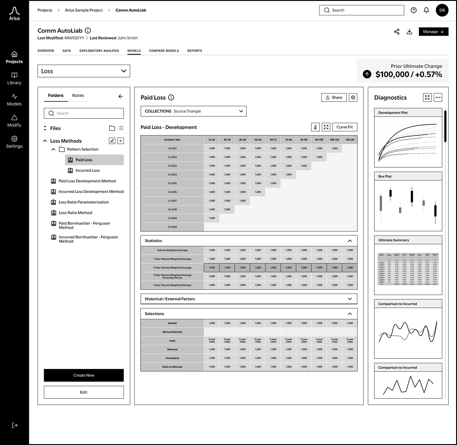
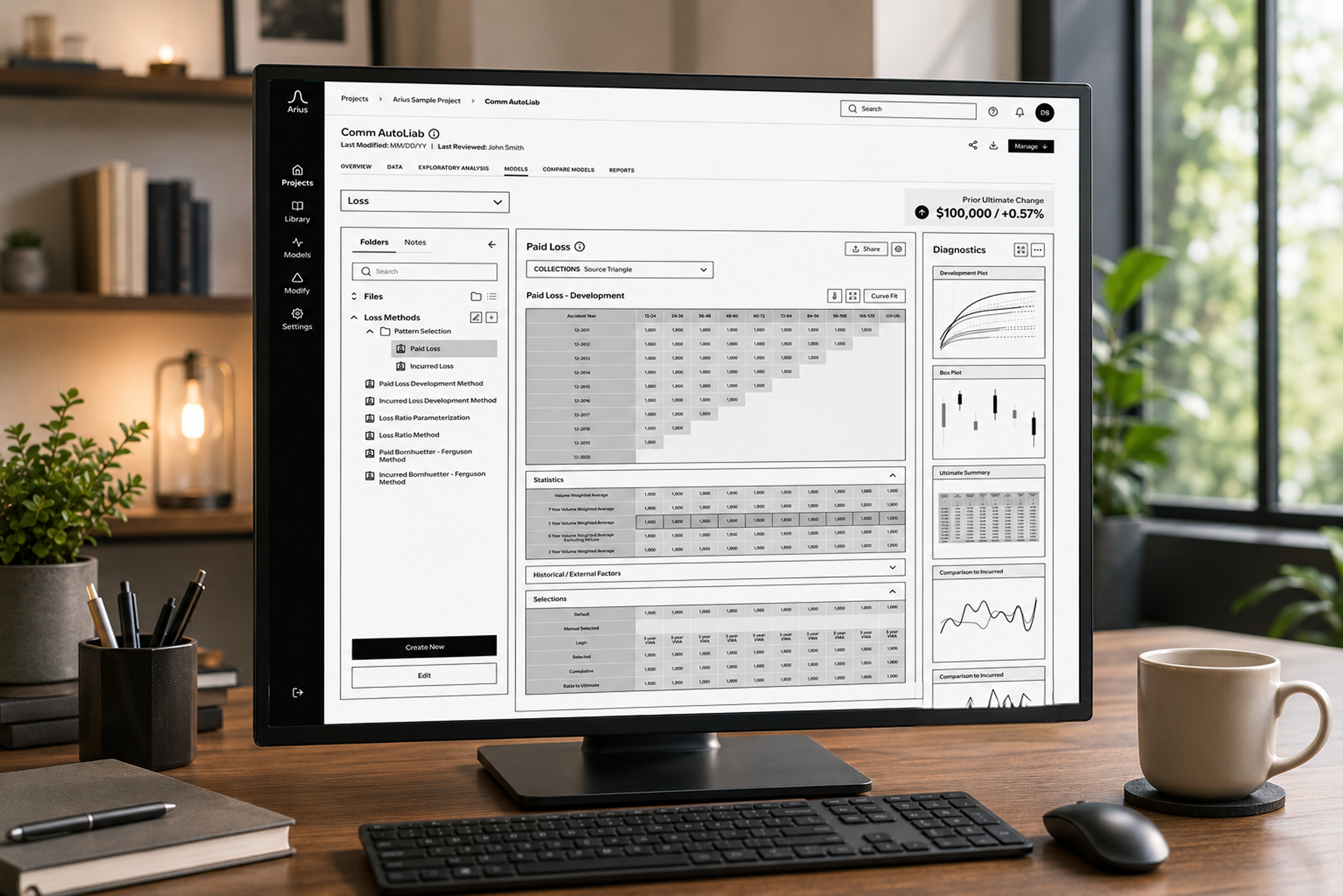
This is where all analysis and visual diagnostics are performed, allowing the actuary to make selections and determine the ultimate loss.
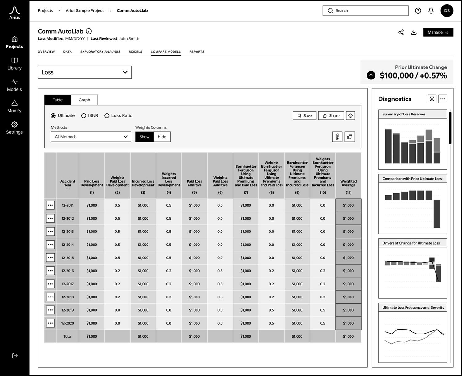
This view presents all the methods from the models section in a table format, allowing users to compare them side by side and see the corresponding weights for each method.
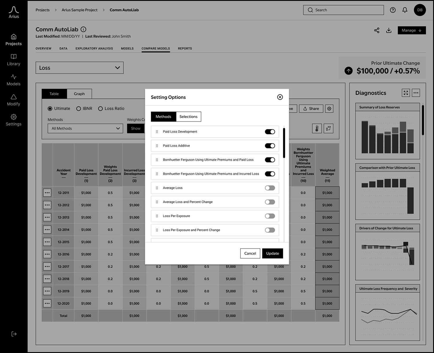
The settings options allows users to configure their methods and selections.
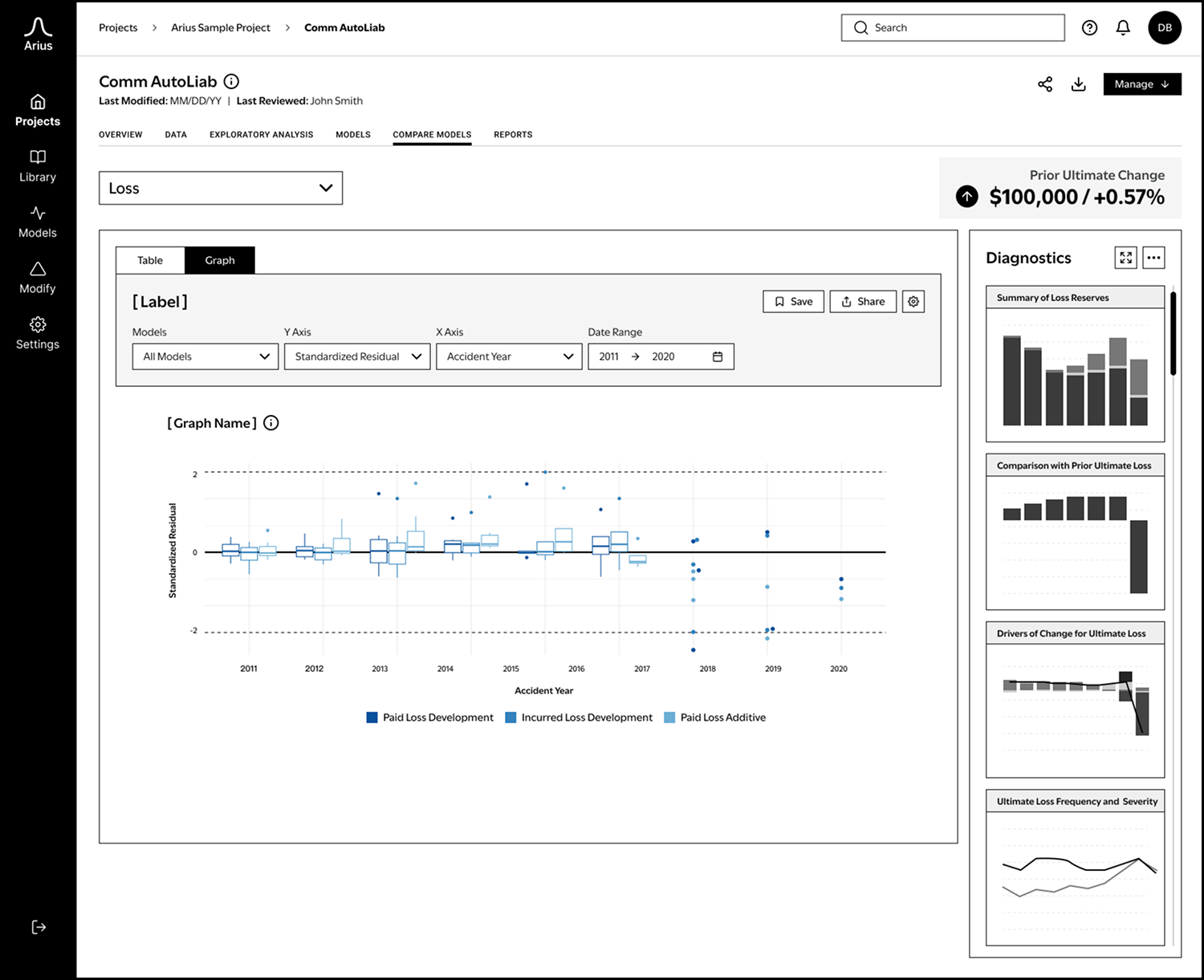
The graph section helps assess compare and understand the model in a different view.
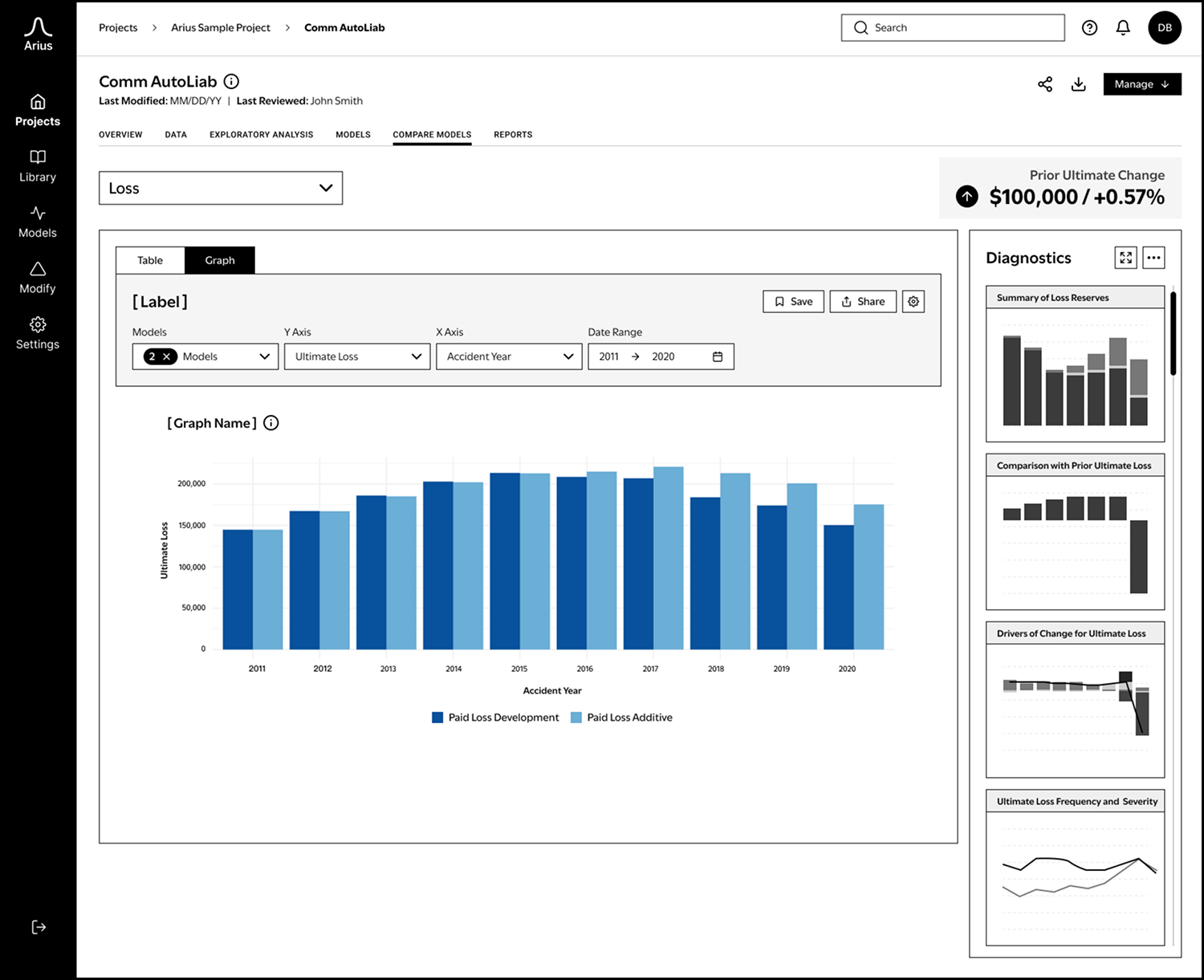
This view is showing a filtered view of the graph where the user has selected different options in the dropdown menus.